The 2010 Logo. Featuring an outdated '@' symbol which TPS had used as a 'department' identifier which has long since been dropped by all but the theatre itself. There is no link to TPS outside of the text, and this I felt was a missed opportunity.
CONCEPTS
Featuring variations of logos to be displayed on office doors or staff uniforms
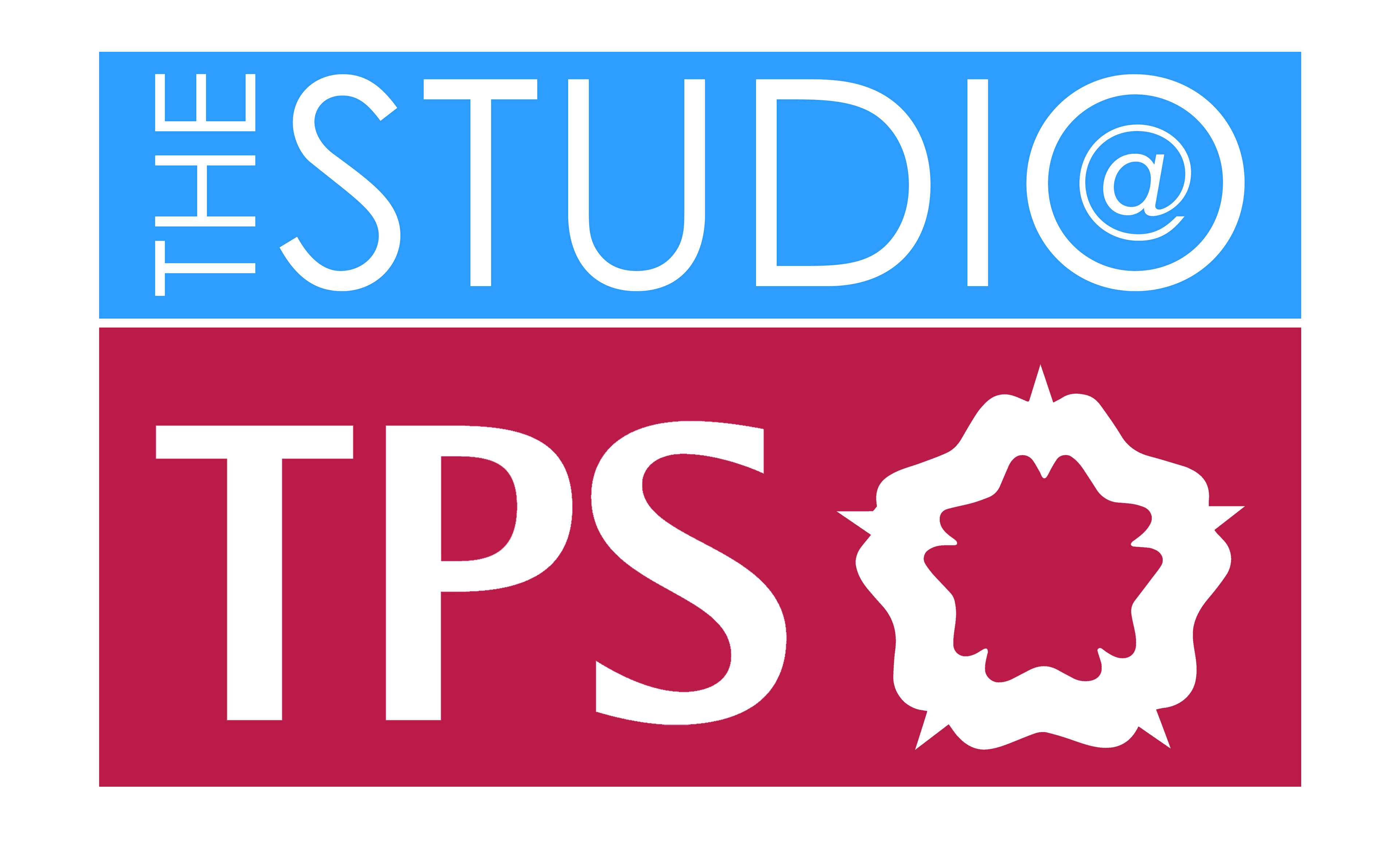
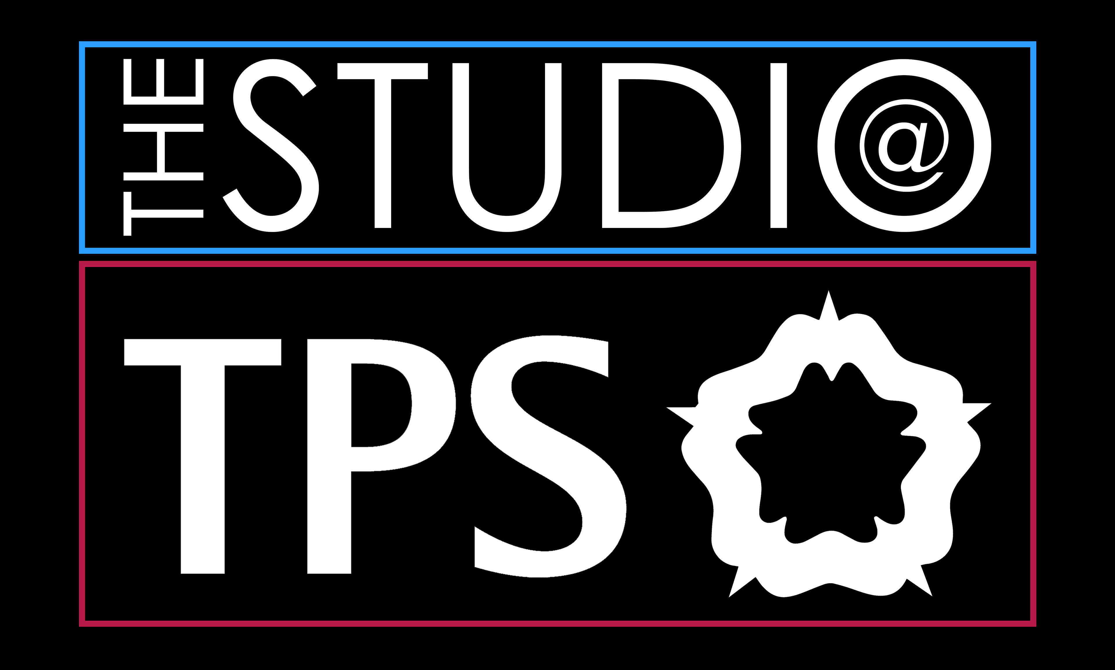







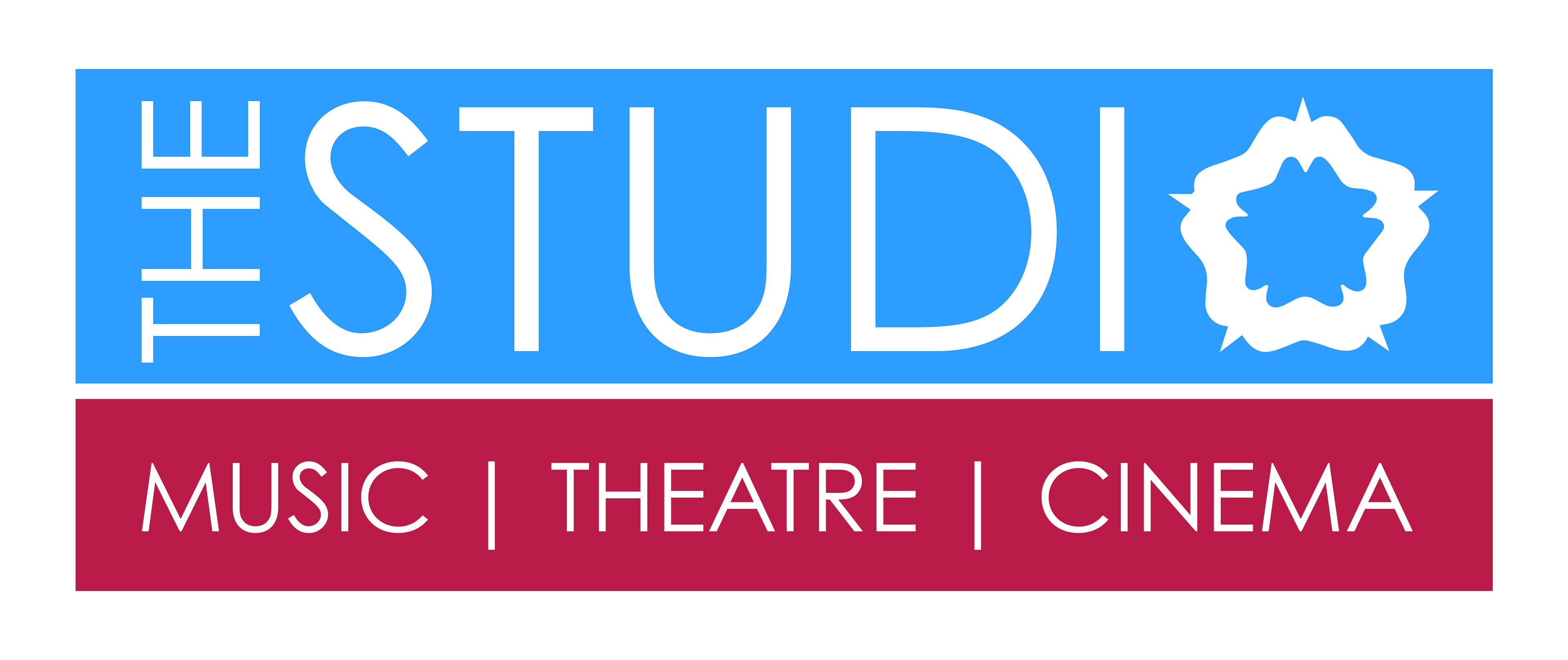
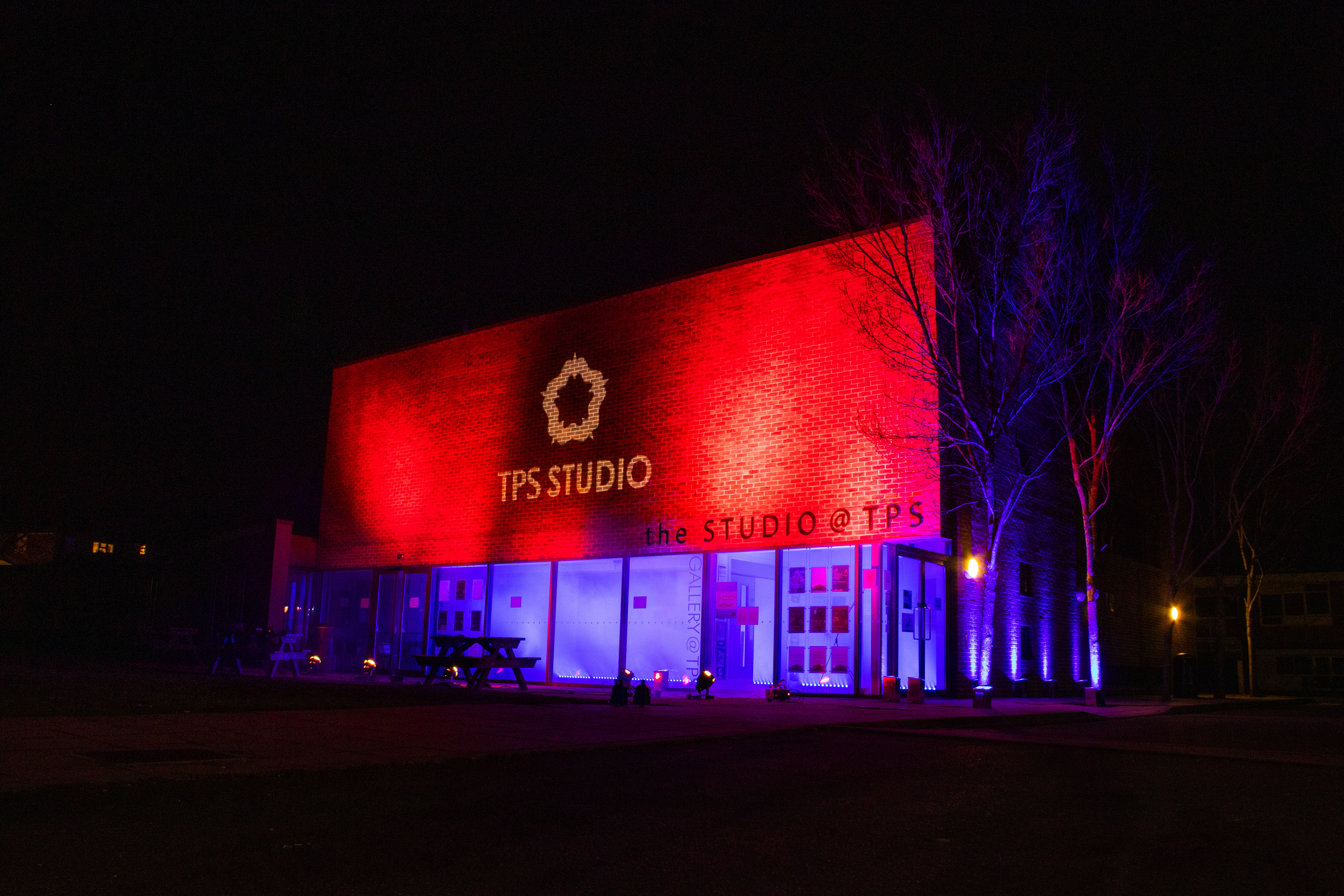
After a few waves of this, I decided to look closer to the TPS logo itself for inspiration. Focussing on 'less is more' and dropping the @ from the brand entirely as it is outdated and antiquated. Instead, having the TPS rosette as a 'featured image' and rolling that out across the entire venue. The name 'TPS Theatre' was also considered, but this was not favoured by anyone - including myself (handily!).



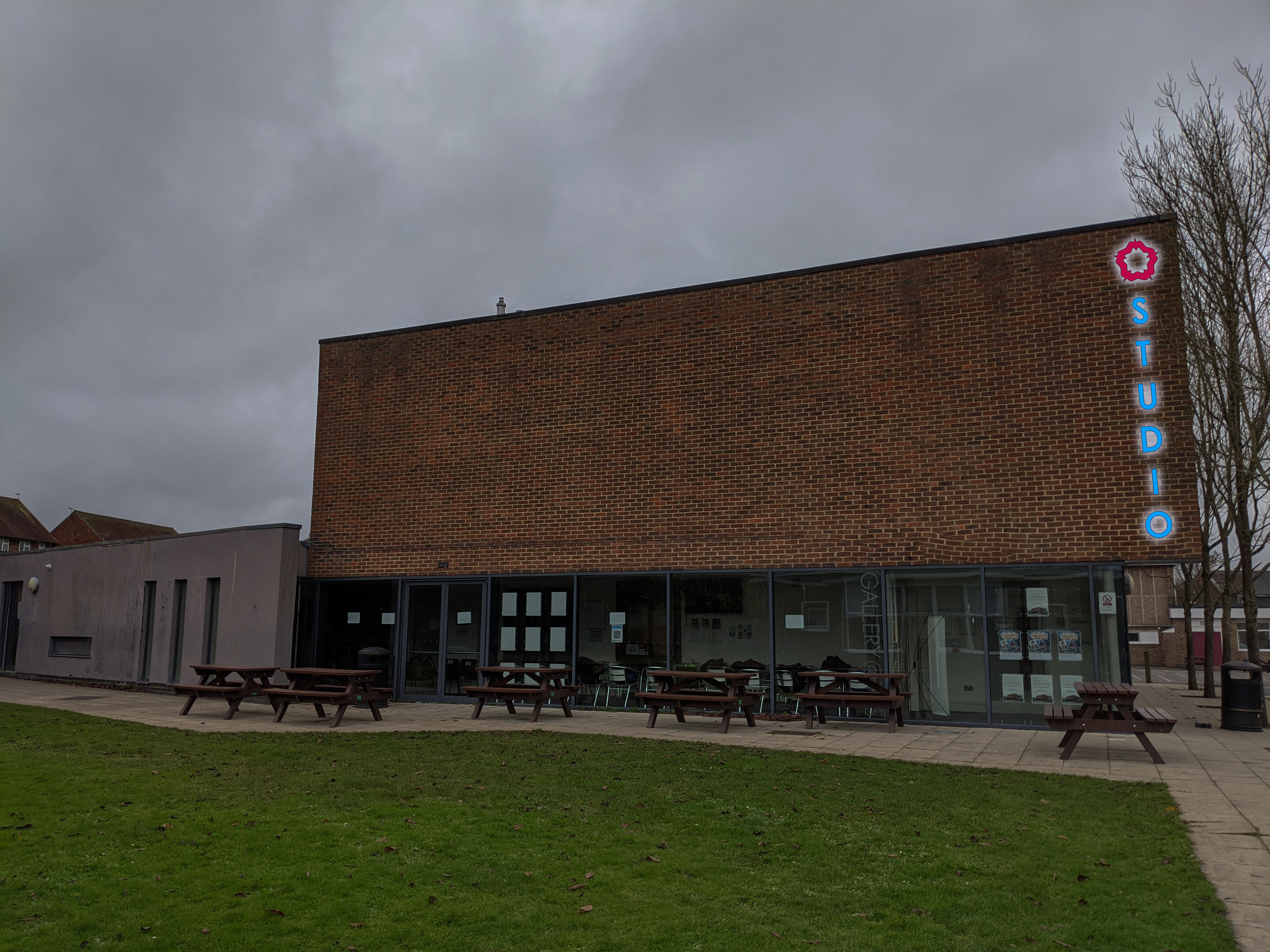
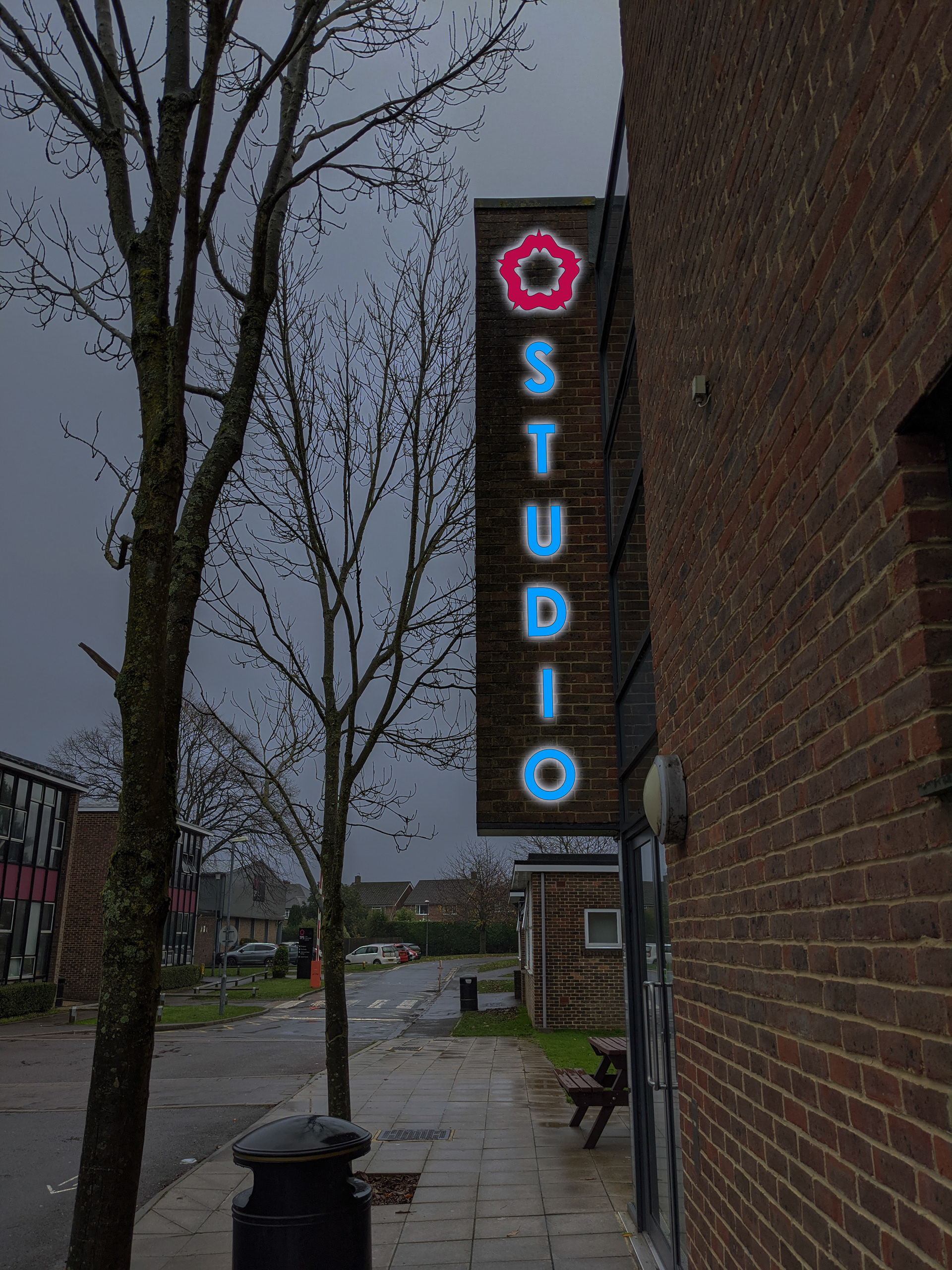

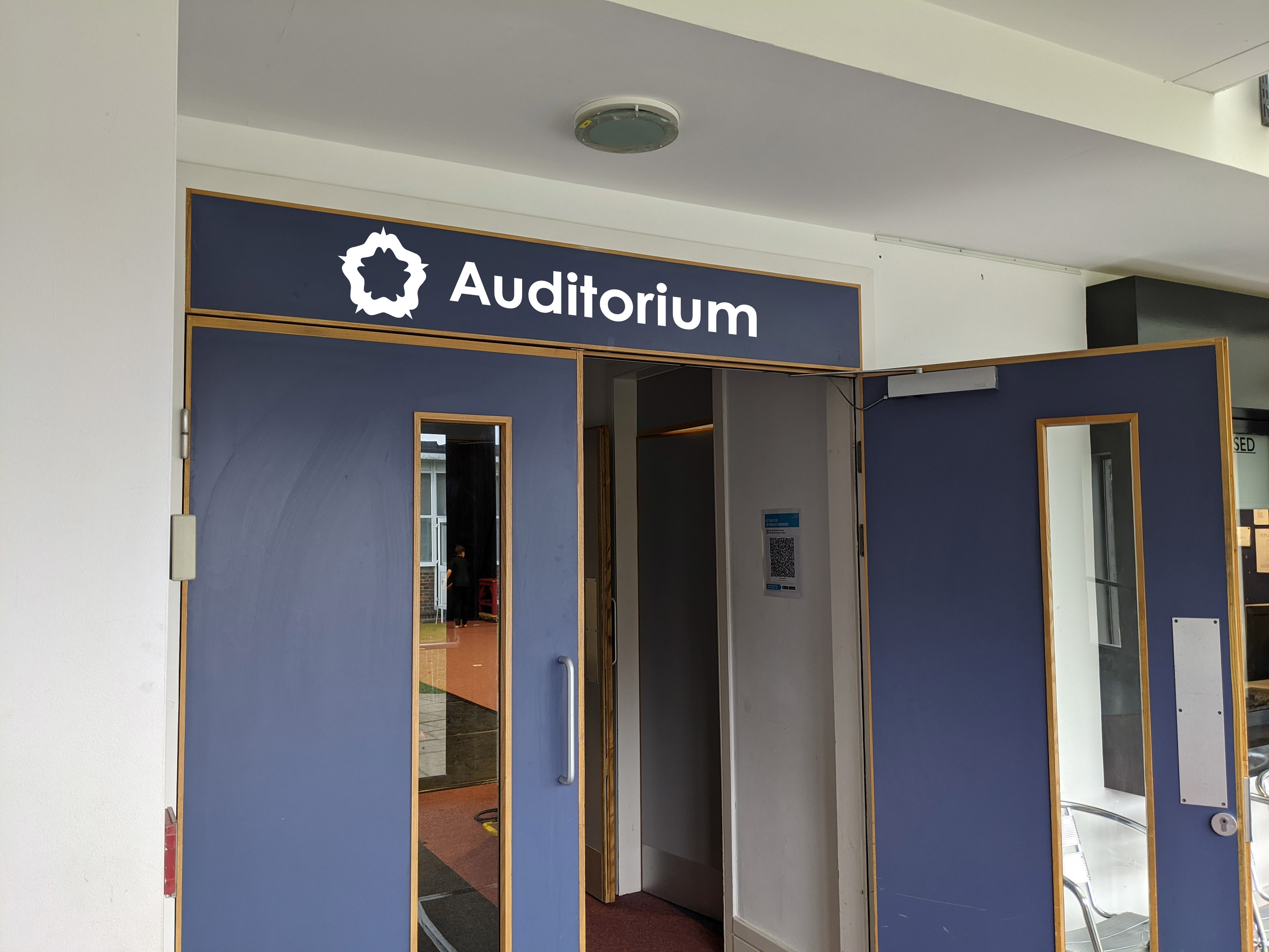
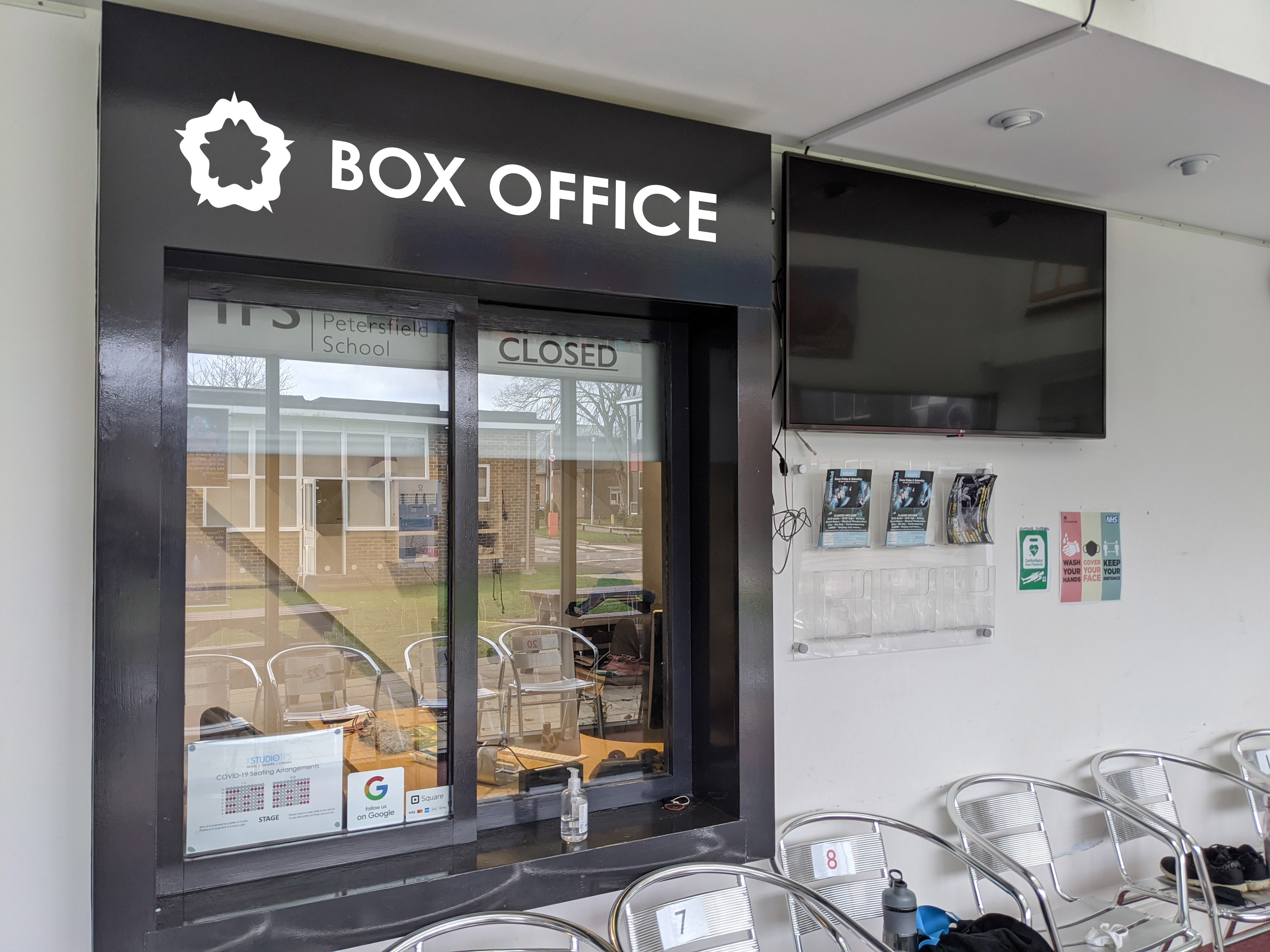
Using the iconography of the rosette, whilst keeping the 'blue' of The Studio retained from previous logos and a bolded font opposed to the original 'skinny' - the new logo felt complete. However, one final change was made before sign off: dulling the blue to make it more readable and less 'in your face'.
Uniforms were then created - with colours coding different teams. Black for Tech, blue for Front of House, burgundy for Bar and white for Duty Manager.




Tech Polo
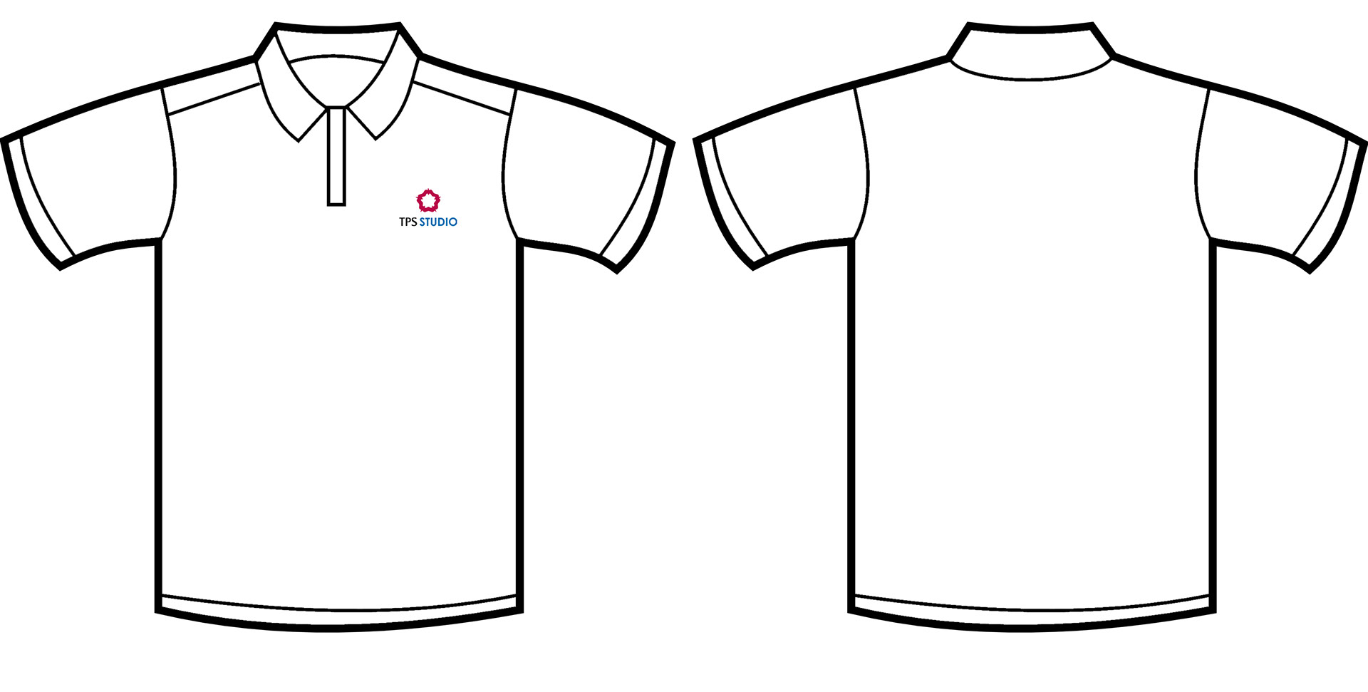
Duty Manager Polo

